Version #3. Learning Live Paint in Illustrator has saved my life.
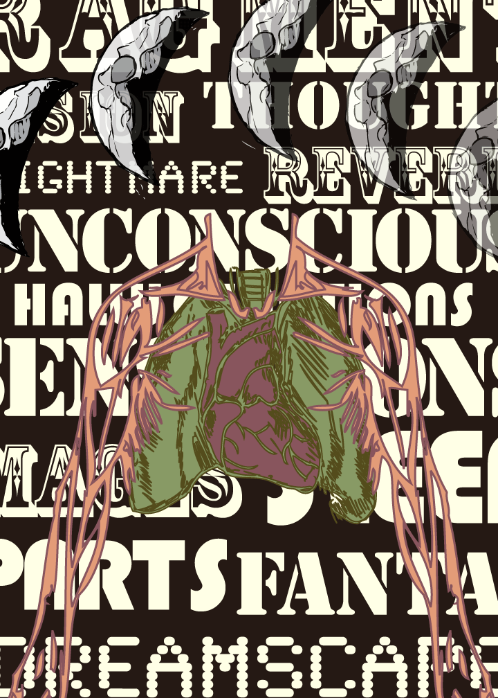
It's a bit dense, which is (I think) a good thing. The only thing I'm considering right now is whether I should have an arc below the lungs/heart shape. I think it would create more repetition and whatnot. Then again, maybe there's enough of that already in the piece.
Just as a side note, this is just the digital version of this. This will be printed out to be passed around to other people in my class. I might post pictures of the real life version (the trading card size, 2.5" x 3.5") when I've figured it out.
glad you got rid of the thought bubble, i found it distracting. As for the fonts I always have a rule of not using more then two fonts. But rules are meant to be broken, I think I would keep them all. I do not understand what the things are at the top?? did you explain that and I missed it??? As of not not crazy about them, just not needed. You may also consider changing the colors of the type, maybe change it to a lighter color then the background, but barely, giving you that fading in look.
ReplyDeleteOh, maybe change the colors at random, meaning all the same color, just different darknesses of each. So they all look like they are coming at you in different levels of sped or depth.
I really like this piece, post as many pictures of it as you can.
Those things at the top are crescent moons - and i didn't explain it, don't worry. i just threw those in for the hell of it.
ReplyDeleteKeep in mind that the theme is dreams: maybe i'm just pulling this out of my arse, but having the imagery dense and just this side of recognizable conveys mystery and all that. i mean, how often do you wake up from a dream and think "what the hell was that?" i want that kind of feeling to come through. i may knock off a couple of the moons, because ultimately i like things at a minimal. but they're there for the long haul.
i like your idea of changing the color to create a sense of depth. i had thought of something similar, but i was just going to change the opacity of the text, not the color. and i know you said something about breaking the rules, i may or may not change the fonts. i haven't completely decided yet.
They're moons...I get it now. But I still don't like them. I like them better then I did a minute ago though, maybe if you just have one full moon off in the corner or something?? Or better yet!!!
ReplyDeleteCreate a tiny solar system and have the planets start off in the front field of vision, then in a line travel around you subject to behind him??
Looking forward to seeing the final on this one though.
Also it seems your wording is conveying that it's a dream, why do you need moons to do the same??
ReplyDelete