4.30.2009

Illuminated


This is the first project for my Typography class. The project was to create an illuminated letter based on a story from this site. I chose "Gown removed carelessly. Head, less so." - Joss Whedon. Regardless of whether or not you can tell that the letter is supposed to be a G I really enjoyed doing this illustration and it took maybe two hours, tops. Not even that, I'm sure.

4.28.2009

Monoprinting 3.0

For this one, I combined the pink image with the cool image. I took the layers of the pink image and applied the colors of the cool image. I had to delete one of the colors, as the pink image has only four layers, while the cool image has five. Which is good, as the new image will take less time to print.

Crap. In showing another student how to work Photoshop magic, I inadvertently created another image that I really like. Stupid providence.


Thoughts? I really like the detail in this one, and surprisingly the color, but I also really like the color in the other one. *sigh* Maybe I'll just print both of them.

Monoprinting


Surprisingly, I'm posting this while in class.

These two versions reflect the color scheme I want for this project. This is the monoprinting project, for my Digital Printmaking class. The project is to have an image with different layers of color to be printed separately from each other. Each of the color you see are different layers in the original file. It took some playing around to get the details that I wanted (the smirk was important, obviously, and the details of the eye). I even went so far as to take notes to compare and contrast several images I made while fooling around.

The goal of this monoprinting, by the way, is to imitate more traditional hands on printing techniques, were you'd carve an image, coat it with ink, and press it into paper, one layer at a time. This way is slightly less labor intensive, and only requires that you have the patience to fiddle with Photoshop settings. I really like how this image looks.

I ask only that you give me feedback as to which image seems superior. I have to have this complete by Thursday, so I'll probably have made up my mind by tonight on this matter. I'd still like feedback, though!

UPDATE: The person who is in this image agrees with me. I won't spoil the surprise as to which I'm choosing.

4.22.2009

I can print.


This is the initial print I made and trimmed, hanging very casually on my wall. No, I didn't use tape - I used that plastic-like substance that's called "tack" or something like that. It's supposed to be non-damaging. We'll see.

I'm exceeding happy with how this looks. Really, seeing it on your monitor is nothing compared to seeing it printed on premium paper (which I payed a pretty penny for, mostly because I forgot the paper I had originally bought for this project at home) and hanging on your wall. I think I could really get into this whole printing thing. It's satisfying.

I think an experiment I'm going to try later in the quarter is going to be drawing on a piece of paper and then printing over that. I think it'll be a real fun bout of experimentation. I haven't even thought of content for my final project (which I think may include drawing + printing) but I think I'm going to enjoy the heck out of it.


This is the image repeat 16 times on a piece of 8.5" x 11" paper (there was some trimming, which you can't really tell because of my amazing Photoshop skills). I printed the image like this because the layout struck some sort of chord in me. I think I'm a really big sucker for repetition. Also, I think that the image is dense enough so that you're constantly looking for some sort of pattern - and it's chock full of pattern, so your mind is constantly at odds and then relieved.

This isn't a part of the actual project, I just printed it out for my own amusement - and because a classmate insisted that I take a piece of his double-sided matte paper. As much as my classmates have been getting on my nerves, they're not all terrible. I'm just a curmudgeon. "This has been another episode of Life Lessons with A Panda. Thanks for tuning in! Ba-bye now."


Quick upload - I think this'll be the last version, mostly because the project is due tomorrow and this is the only day that I can print it out. I got rid of the crescent moons mostly because everyone kept asking what they were. I mean, it was obvious to me, but then again I was the one that made the image.

Of course, once I hit upon the idea of adding planets to the mix, I had to go through and add most of them. Conspicuously absent are of course Earth and Pluto. I'll let you guess why those are absent. Hint: I'm lazy and one of them isn't a planet by definition anymore and I didn't want to try to find an image of Ceres. Think of me what you will.

UPDATE: The printed version turned out really well. I'm very happy with this project, despite the 4 straight hours it took me to print it out today. I probably put in around 10 hours on this, and I think it shows. I'll be posting pics later tonight of the printed version, as promised.

4.21.2009

More boredom from the frontlines


Again with the screwing around in class. This is going to be a productive quarter, I can tell.

UPDATE: I've corrupted those around me. And turned another person onto the greatness of Live Paint/Live Trace in Illustrator. My work here is done.

Boredom from the frontlines


Must be quick. In class. SH!

I did this in Illustrator while not paying attention in class. Hooray!

4.17.2009

Mission: Dream


Version #3. Learning Live Paint in Illustrator has saved my life.

It's a bit dense, which is (I think) a good thing. The only thing I'm considering right now is whether I should have an arc below the lungs/heart shape. I think it would create more repetition and whatnot. Then again, maybe there's enough of that already in the piece.


Just as a side note, this is just the digital version of this. This will be printed out to be passed around to other people in my class. I might post pictures of the real life version (the trading card size, 2.5" x 3.5") when I've figured it out.

Dream Theme, redux.


Version 2.0 for your viewing pleasure. I've made a few changes, if you can't tell. The background, for instance, is much darker, but still brown. Oh, and the text. I'm wondering if I should stick to one or two fonts would be better, or if three is fine. I think I need to do something with the thought bubble. I will consider this. Obviously, this isn't the last step. I have until Tuesday to figure this out. And then I have to figure out how to print this on paper that I don't have the correct profile for and that I'm not entirely sure is sealed for printing. Ah well, experiments will need to happen.

4.14.2009

Can't get enough of that robot feeling.


I'm only slightly obsessed with this piece. Here's a third version of it!

Dream Theme


This is a project which I'm doing for my Digital Printmaking class. The theme that the entire class decided on (after 20 minutes of shout out things and 3 votes - no really, three. Trés. San. III.) was "dreams." This, of course, is a fairly broad, wiggly word that has a couple of connotations. Unlike, oh I don't know, "invisible." No, seriously, that's what someone shouted out for a theme. "Invisible." *SIGH*

So, after we'd settled on a fairly easy to do theme, I let my brain chug away at it for a few days. I didn't actually do any concept sketches, because frankly I'm lazy. I know that concept sketches are quite essential to art in any form, and that they are analogous to showing your work in algebra, but I'm just lazy. I'm working on that, though.

I think my first draft is a good shot and I like the direction that it's going. I want the background to be busier, but I'll have to play around in Photoshop Effects to get the feel that I want.

This was created by sketching over two images I grabbed from Google (an image of the lungs and an image of an arm from da Vinci's notebooks) in Photoshop using just a plain old oval brush. I then opened the .jpgs in Illustrator and turned the sketches into Live Paints and expanded them. Don't worry if you don't understand what I just said, I'm not even sure that I do.

After I turned my pixels into vectors, I played around with the colors of the arm (of which I'd created a reflected copy using magic alone) and the lungs. During this exploration, I decided on a pastel palette for the image. I think the softer colors work better for the "dreamy" quality I'm going for. I might play around with opacity and layering. Ooooo.

I added the thought bubble in Illustrator and colored it a really light blue, which is hard to tell on the brownish red background. Again, I think I'm going to play around with the background to give the piece more energy or something like that.

Tell me what you think!

edit: Just an extra note, the dimwits in my class decided that we should be restricted to a 2.5" x 3.5" space while working on this project. Thus the smallness of the image - any bigger and you'd see my pixels. I, personally, would have loved to do this as a postcard (3.5" x 5" according to Wikipedia). Ah well.

4.10.2009

Spouting random ideas.

I'll probably have some sketches or thumbnails of these ideas ready in the next couple of days, but I thought I'd jump the gun a bit and spew forth some ideas I have generated for the first/second project for my Digital Printmaking class (hereafter known only as GID40). I say first/second, because the first real project for GID40 is to create and print a test strip. This test strip is basically so that you know that your printer is printing the colors you've chosen in whatever software you've chosen to use correctly. There's some deal with profiles and how they're different from paper to paper and printer to printer, but it's all very technical and not fun at all.

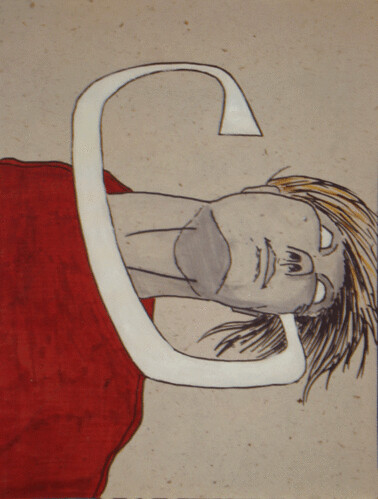
So, some of the ideas I've brainstormed (in class, of course) for the projects I'll have to do for this class are pretty simple, and easy to pull off. Maybe not the most original of themes, but the theme doesn't have to be original, but the work itself should be. I'm also thinking about incorporating text into these images, since I'm also taking a Typography class (I may have mentioned this, but I wasn't paying attention).

A brief list of ideas for themes/content as follows (including a brief description of what I'm talking about)
  • Things in Unusual Places: This would basically be me juxtaposing two unrelated objects, one of which would probably be a landscape or landscape-esque (ie, a place). An example would be a hillside with a close-up of an ant's head rising over the horizon, or a picture of a tree with a watermelon hanging from it's branches. It's quirky and not terribly symbolically laden, which is what I do best.
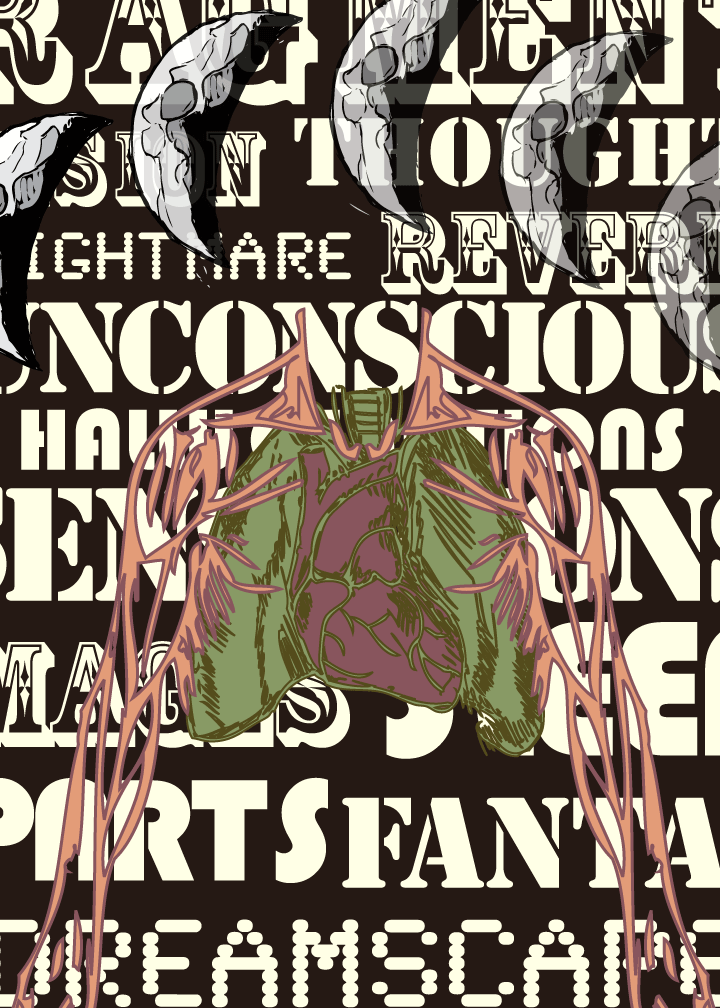
  • Visuals + Text: This could be pulled off at least two different ways that I can see: A) Text collaged with images or B) Text becoming an object. I think, visually, B would be more interesting, and I wouldn't necessarily want to something clichéd like have the word "face" be used to create an image of a face.
  • Opposites: This is the one that appeals to me the most, even a bit more than Things in Unusual Places. I think I would enjoy doing something like this more because it would engage me on a more cerebral level (ie, I'd be using my brains). Let me transcribe my poorly scribbled notes on this: "Maybe combine with Visual + Text: Visual one thing, Text the opposite of that, vice versa. Eg, picture of candle w/ word "dark" incorporated Ground w/ text "sky" or "up" > Can be a good series." And I'm sure that if I thought hard enough I'd be able to work in Things in Unusual Places.
I think I'm most partial to Opposites because it's simple. It wouldn't take more than half an hour with a thesaurus to get a good list of words to use for the theme. And I really like thesaurii.

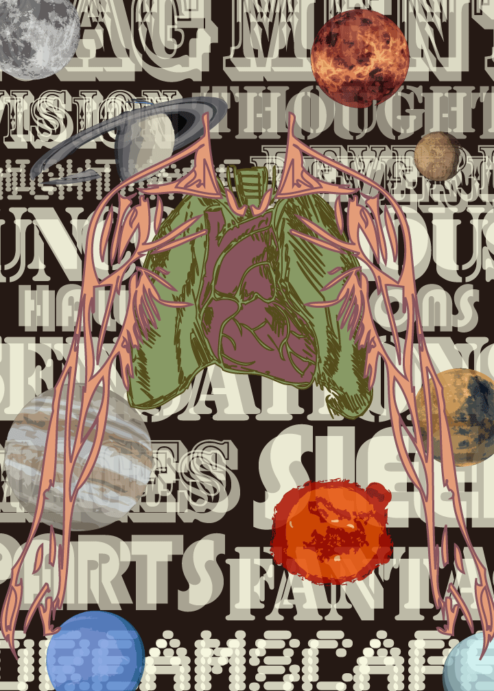
Hm... looking over I see more inspiration and, surprisingly, it comes in book format. The book in question is "NASA: Visions of Space," and it's basically a picture book of awesomeness. The pictures are various images taken by NASA telescopes (I assume many of them from Hubble, glorious glorious Hubble) and would work great for Things in Unusual Places. And it feeds into the overwhelming need that I have to incorporate space and astronomical images into most of my body of work (I don't often do it, which is why you all haven't seen this desire reflected in what I've shown you).

See, now that idea of incorporating spacey images has merged with my fascination of the human body. Which is a good thing, because ideas are great. It's the follow through that I'm a little wishy-washy on.

So, yes, I will contemplate the mysteries of the universe and attempt to transcribe them on flattened wood pulp. Then, I will take a photo image of this flattened wood pulp, digitizing it onto my computer via my camera device and upload it onto the Intertubes while hanging from my Interwebs. And it will be a glorious adventure for us all.

If anyone has any other ideas they think I should monkey around with, feel free to tell them to me. I'm not shy about taking other people's ideas and running with them.

4.06.2009

*SIGH*

Spring break is over.

This means two things: 1) no more playing in the sunshine for several months; and 2) more pretty images to post for your viewing pleasure, as I'm taking two classes which should invigorate my creative juices. Typography, with a teacher that I've had in two other classes and absolutely adore, and Digital Printmaking, with a teacher I've never heard of (which isn't surprising since I don't really pay attention to those sorts of things).

I'm actually really looking forward to this quarter; I'm hoping to get a few portfolio worthy pieces out of my printmaking class. I'm not expecting to get a lot of sleep, though, as I'll be spending approximately 10 hours on homework per week per class (math tells me that equals about 30 hours a week in homework alone) and working 30 hours a week so that I don't have to be some sort of bum on the streets.

This summer, however, will be the summer of great things. I'll be applying for real colleges (I think they call them 'universities'), spending some time in Oregon, and maybe even learning me some HTML. Ok, the HTML learning isn't really that impressive, but it means that I will be one step closer to have a website of my art, rather than just a blog. Not that there's anything wrong with a blog, of course.

4.03.2009

Robot v Ant


I like this version a lot more that I liked the one that I turned in for my class. It's much simpler and cleaner. A bit darker, too; the bright colors were irritating me a bit. So, please, let me know what I did right and what I did wrong, and feel free to leave some delicious cake when you do.

As an aside, if it weren't so gosh-durned beautiful outside these days, I'd be much more productive inside. Ah, well, I guess I'll just have to drag the ol' pen and sketchbook out into the verdant wild with me.

ETA: I'm considering the grass... I think I might add a stroke to it. It doesn't fit well with the other elements in the composition.

Well, I'm done for tonight anyway. Maybe tomorrow.

4.02.2009

Clouds, clouds, more clouds.


This is one of the projects which I'll be working on over the next few weeks. It's really easy, and I'm pretty sure a monkey could do it. A monkey that understands Photoshop, that is. I'm only an ape that understands Photoshop. I don't even have a prehensile tail, how lame is that?

So I'm not 100% sure what this image will be used for, really. The guy I'm working with is this artsy guy that comes into my work, and he sort of explained what he's trying to do, and I got a vague impression that he was trying to do something good. Well, I also got the vague impression that he just really wants to make a name for himself and make a bit of cash, but whatever, that's his prerogative. I just offered up my skills and knowledge of Photoshop, and while this was fairly tedious, it isn't the worst thing I've ever had to do.

I think I'll take a break, though, and fix my Robot v Ant image. I really want to fix that - it's been driving me nuts thinking about it.