12.31.2009

Penguin Interlude

I drew this very quickly (it took about 40 minutes from start to end) for one of my friends. Crayons and art marker.


Again, the paper is white, not yellow. I should really remember to color correct my photos.

There go the Cats

And the final results for all the linoleum cutting that I did:


This shirt is actually white, not yellowish-tan as seen here. I didn't color correct the image after taking it, and the lights in my house are all really yellow. However, it does look good on that color, so if I ever find a shirt that color I'll be sure to print it.

12.29.2009

Here come the Cats.

I did three linoleum prints of the house cat Bartleby. It was both a nightmare and great fun. All of the prints turned out as well as I had hoped.


The three different linos I prepared for the print run.

Present the Third.

I cut this lino after a complete and abysmal failure to screenprint this leaf on a canvas bag. Granted, I could have easily over come the hardships on printing on the bag, but it was early in the morning (for me) and I like lino cutting way too much.


Ta-da!

It's a pretty small lino block, a little bigger than an index card. In addition to how nicely it prints, I just love the look of a freshly carved linoleum block. I kind of think of it as psuedo-sculpture - really, it's more like bas relief. My favorite part of the entire process is simply cutting away at the linoleum. It's just really fun.


In order that I might save myself the hassle and cost of buying many bags and testing the print on those bags, I did test runs of the prints on paper - both Bristol and newsprint. All of my linos turned out well on the Bristol paper. That table is also the area that I did all of my printing on.


Finished product.

And this is how the lino printed on the canvas. Much better than my attempt at screen printing the leaf. I printed the image on both sides of the bag, but felt it was only necessary to show you one side of the bag - I figured you'd get the idea.

Present the Second.

This one was really easy to do, since I already had the lino prepared - I used a lino that I had cut for my GID 32 class. This image is probably the second favorite of all the shirt designs I made for GID 32 - the first being the E Coli shirt, which I still need to print for myself.


Wasp on bag action.

I'm thinking that I want to print several more shirts and/or bags with this fella on it. He's awfully popular and I think I could easily sell a few online through Etsy and the like.

Present the First.

As I may or may not have mentioned in a previous post, I decided to make shirts and bags for most of my friends this year in celebration of the holidays and my new printing skills. At the end of it all, I had printed 4 shirts and 2 bags, which is more than I did for an entire quarter in my GID 32 class. I'm pretty surprised at these results, especially if you consider that I went from concept to product in about a week, a week and a half at most. What took the longest was the linocut carving - I think one particular lino took about three or four hours to cut.

So now we begin the journey through the presents. I didn't record any of the flubs and mistakes I made along the way, but believe you me they exist.

The first present: a screen-printed T-shirt. Printing on black is the bane of my existence. But I did it and I'd do it again, but probably with more success and less frustration.


I drew an ice cream cone on tracing paper for my template.

Cute, isn't it? I think so. Simple, as well. Simplicity is what I like best in my art.


A shot of the screen after I had coated it with screen filler.

Screen filler, as I may have mentioned a few times, is not my favorite product. I can see the utility in using it if you want really loose, graphic images without a lot of detail. But it can be rather... frustrating to use. There may be cursing involved.


Proof that I can, in fact, pull a screen.

The end product wasn't completely professional looking, but I stand by my product. And the friend who received this particular present seemed happy enough with it, so mission success.

12.28.2009

A taste of what's to come.

I've just uploaded many pictures to my Flickr page. It took much longer than I expected, partially because I wasn't aware of just how many images I had on my camera (425) and partially because my camera battery died 51% of the way through.

What follows is a small sampling of the art that I created this past Christmas week. I, personally, am quite amazed at my own productivity.


In addition to old-fashioned linocuts, I did a little bit of screen printing. I'm thinking that I don't really care for the screen filler, so I plan on getting the tools that I need in order to make my screen printing more or less viable.


So, as soon as I'm able to sit down, I plan on going through each project that I did and doing a mini-post about each.

12.20.2009

Screen printing.

So, with my new screen printing kit, I've learned two vital lessons already: planning is important and having an appropriate work space is important. If you do/have neither of these things, you will rue the day you decided that you wanted to print t-shirts and bags for your friends for Christmas.

In other news, I've been able to kick out several good designs for the bags/t-shirts that I want to print for and give to my friends. I have less than a week to get it all done in, but I have high hopes. Worst case scenario, I don't finish them and my friends hate me forever, but not only is this case worst possible ever, it's highly unlikely.

12.17.2009

End of the quarter semi-wrap-up.


This was my last project for my ART 86 class. It was done in Corel Painter, as was every other assignment for that class.

I'm really happy with how this turned out. I'm sure that surprises everyone, but I think the style especially is really strong. The sketchiness of it suits me, I think. I used techniques that I learned in a previous class, and I think I was able to use those lessons well in this piece.

I think my favorite part of this is the minimal color I used. It really adds to the mood of the piece and creates interest in the figure, which of course is important.

I've noticed that the ledge that the figure is standing on isn't as finished as it could be. I think I'll work on it - I think I know why it sticks out to me, so I should be able to fix it. I won't be able to start on my gifts until Sunday anyway.

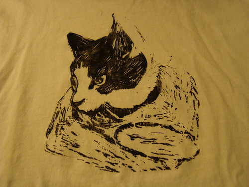
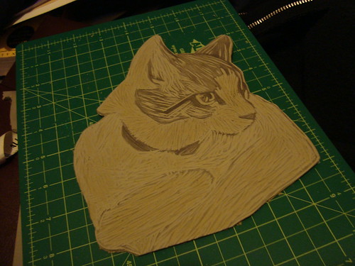
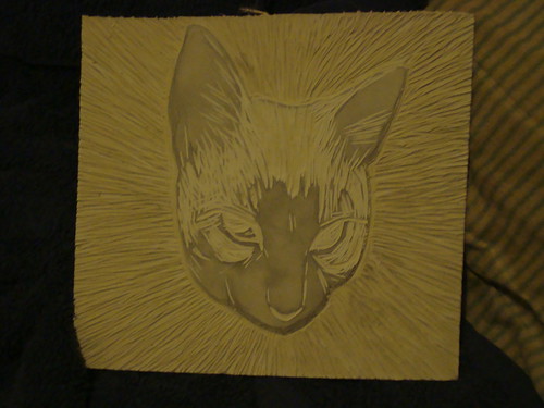
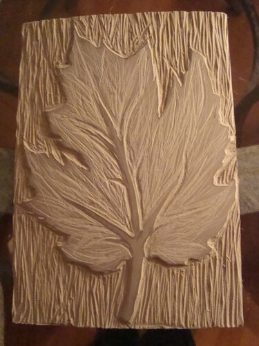
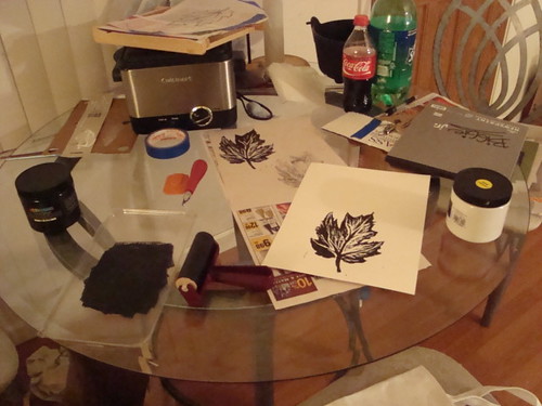
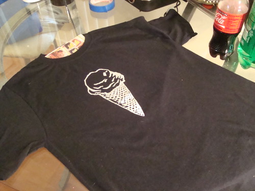
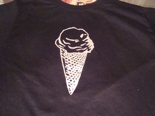
Speaking of Christmas gifts, I'm really excited about the screen printing kit that I bought in SF. Not only can I print on fabric, I'll be able to do prints on paper. I'm hoping that I'll be able to start my own mini-business using this kit - as well as making linocut printed shirts. I have some images of the linocut printed shirts, I think, and if I don't I'll take some. The two that I did turned out really well and I enjoyed making them, which is very important.

I think this is the first time I've actually taken something that I've learned in one of my classes and taken it outside of the classroom. The first time I've been able to use what I've learned in one of my classes practically, any way. Sure I can draw and use Illustrator and paint, but printing really engages me. I never would have guessed it, to be honest. I think it's a combination of using my hands, being able to use sharp objects, and being able to make messes.


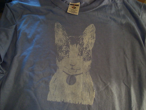
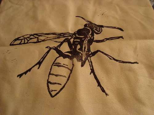
Here's one of the shirts that I printed using screen printing techniques - it has been by far the most popular print I've done, and that means a lot to me. Not only are people giving me compliments, but I'm able to engage people on science. I was able to do that with the other science-based art I did for my printing class - I think I did a post about that design. If I did, I'll add a link to that post. Edit: Here's the link.

I hope that I have time before school starts to print one of these E coli shirts for myself - the above is a small and thus only fit for tiny people.

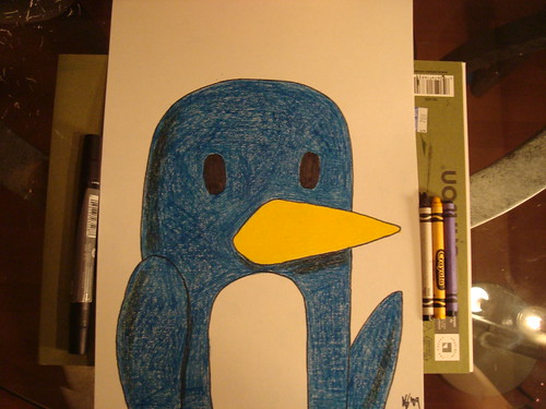
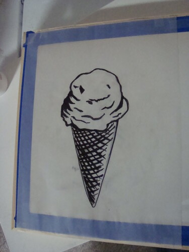
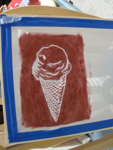
I'll try to post some images of my printing process for my Christmas gifts - I've already taken some pics of the first design I've done. (It's an ice cream cone. :D) Note to self: Screen filler is difficult to use. And kind of frustrating to use.

11.27.2009

Latest work


I did some more stuff to the sketch I posted a couple of posts ago. I like how it turned out. There isn't much else to tell about it. I think I could have done something different with the ray of light that's shooting out from the figure's finger. If I figure out something I'll likely do something about it.

My t-shirt projects are going well enough. I have three designs printed in total. I hope to have another two done before the end of the quarter. I'd like to do more, and I could except for the fifteen other students that have shirts to print.

11.01.2009

Cat


This was done for my ART 86 class. I used a reference photo, since getting a cat to sit still for too long is pretty much impossible.

10.29.2009

Random sketch


Just a random sketch I made in Painter. I don't know if I want to do anything more with it. I had wanted to have a rocket in the background, but then I realized I didn't know how to draw a rocket.

10.28.2009

For Halloween - WIP


This is an image I created in Painter for a future class assignment. I used pencil, oil and bleach to create it. It's not really based on anything, I just started sketching and built from there. I think it's going well, but I still want to tweak it using the Clone feature of Painter.

Halloween is coming up and I'm not going to be dressing up. Can't really think of any costume that I would want to wear. I used to be interested in Halloween, but my interest in the holiday has waned. I still enjoy seeing costumes that people come up with, but cosplay is year round, after all.

10.21.2009

Mushroom fairy.


He's a cutie, I know.

An exercise from my ART 86 class. I think I went a little overboard on the complexity of it, but I'm ok with that.

10.17.2009

Bumps on a log.


I forgot about this one. I had fun with it. And no, I'm not suddenly an amazing painter, I got to use the Clone brushes in Painter. I used a picture I took at Big Basin National Park (here on my Flickr page, where you can find other art stuff by me - most of it here on this blog, actually). It took a couple of takes, and I learned a few good lessons along the way. I forgot them promptly, but at least I learned them, right?

Die Header with a Vengeance.


Yes, that is a horrible pun. No, I am not going to apologize for it.

I made a header for a design website that I'm slowly creating for my GID 56 class (website design, if you couldn't tell). I used Fireworks and managed to figure out how to link the buttons to the proper pages. Hurray!

There's really not much to say about it, except that I'm probably going to tighten the design up - that is, move all the elements closer together so they aren't so lonely.

Rebirth - Fin


I finished a digital painting and I'm happy with it. This is a two-fisted project - I've submitted it for my ART 86 class and I'm going to submit it to a collaborative group-for-all with the theme of "rebirth" (thus the title) for the Foothill Art Society.

Now if only I could worm this into my GID32 and GID 56 classes. Four birds with one stone is my goal here, really. I think I can squeeze three birds out of this stone, at least.

Oh, and speaking of birds and stones, I finished my first solo project for my GID 32 class (the T-shirt printing class). I'll post pictures of the screen-printed-by-me shirt when and if I ever remember to. I know where my camera is, really, I do. I'm really really happy with how the shirt turned out, but more on that later.

10.11.2009

I'm organic - are you?


This design is commentary on the use of the word "organic" in pop culture. I would rant about it a little, but I don't really feel up to it. Let's just say that some words have precise definitions in certain context and pop culture tends to ... dumb it down a bit.

The molecule on display is ethyl formate. If you're an astro-geek like me, you'll know that this is an organic molecule that's been discovered in space. Oh, and it's one of the molecules responsible for making raspberries smell like raspberries.

Yes, boys and girls, space smells like raspberries. And rum, actually.

This design is for my t-shirt design class. I hope to print tomorrow.

10.08.2009

Monocle Pear


Yes. It is a pear wearing a monocle. It's for an exercise for my Art 86 class. I think this idea came from a combination of too little sleep and too much coffee, plus some Bad Religion. I've been somewhat goofy all day, though, even without the caffeine or the Bad Religion, so I guess it's mostly stemming from my sleepiness.

10.03.2009


This is the pretty much finished version of my first project for ART 86. I'm pretty happy with it. I think that I want to add some details in the sky, but I'm not sure how I want to finish it. Now on to the next one, I guess.

So I was bagging today...


A comic based on a true story.

10.02.2009

Tower WIP


I've been working on this for the last weekish, off and one, for my ART 86 class. I tried it with the Digital Watercolor variants, but I didn't feel that the brushes worked well with the image. This version is done with the Airbrush variants. It's probably about half-done. I need to work over grass, and add details to the towers and sky. Not sure how I'm going to do it, but I have a week to finish it for my class. It's not a terribly difficult work, and simple, which was purposeful.

Now I just need four more ideas for works that I want to do in this class. We'll see what happens.

9.27.2009

Random


Just a random image I created with Painter. Made with a black canvas, the Scratchboard tool and by creating a layer mask, then using the airbrush tools to color it in. Feel free to interpret as you wish.

Fire!


This is a sketch of fire. Just in case you can't tell what it is. I used the Digital Watercolor brushes in Painter. Also for ART 86. Now I have to start a two-week long assignment for that class. Need ideas. Google Images here I come!

Pumpkin


I drew a pumpkin in Painter for my ART 86 class. I used various acrylic brushes to make it. I could ave done a better job, but I'm still getting used to the impasto brushes versus the smooth brushes (that don't imitate thick paint). I think I'll play more with the impasto brushes, because I'm fairly used to programs that smoothly put down pixels without imitation of real paint. Photoshop does this, as well as Illustrator.

I also have some ideas knocking around in my head for my T-Shirt printing class (GID 32). Not any that are developed much, but they're in there (my head).

9.24.2009

Update

School's off to a good start. I'm enjoying all my classes so far, and haven't gotten behind yet. Ok, it's still the first week, sure, but I have a tendency to procrastinate even early on in the quarter. Hopefully not this quarter. I've said this for just about every quarter I've been in school, of course. Procrastination often wins.

Here's a sketch I did for one of my first assignments in my "Painting with a Computer" class (hereafter called ART 86 for brevity's sake). It's my hand. I made notes in the file just so that I could remind myself of what brushes I used without having to create some sort of text document to keep track.

9.18.2009

I make posters free.


I did this yesterday for a coworker from Peet's. She and a friend are musicians, and will be playing sometime this weekend. I hope I'll be able to go, mostly for a show of support.

I'm not so keen on writing text for posters, but I definitely enjoyed doing the composition for this one. It was a bit of a challenge, since I wanted to layout the text according to how the illustration sat on the page. The bow for the violin was troublesome, but I think I overcame it well enough.

The font is "Bodoni Handwritten," a free font I got from a free font site I can't find or remember now. If I find it later, I'll be sure to post a link to it, because I think the site I got it from had quite a few neat fonts.

9.06.2009

It's still summer, right?


Well, my projects never saw the light of day due to life happening. I won't bore with deets.

I just got Corel Painter IX, and did a doodle to play around with it and see how I like it. Then I deleted that doodle and did a quicker doodle that just uses a Fine Point Ink brush setting. I'm hoping to be more comfortable with Painter before school starts.

6.26.2009

Summer Project: Day One

Now that school is out, I have at least two projects that I want to work on. Wait, make that three. Or is it four? I lost count.

The first project is more of a goal. And that goal is to do a sketch a day throughout the summer, hopefully longer. I'd like it to be as polished as possible, but I don't think I can achieve that everyday. So, some days it'll be a quickie, some days a more complete image. Probably all, or at least most, will be composed in Photoshop.

More on the other projects later, I think.

Day One:

6.23.2009

Printmaking posters.


These are the posters for my digital printmaking class. I've definitely enjoyed this class, and it's made me want to take more printmaking classes. Combined with my typography class, I also want to take a letterpress class.

Typography poster


Last project for my typography class. I've really enjoyed this class and I think I've learned a bit.

6.02.2009

posters


These are the two that I'm most satisfied with. I'd upload the other two, but I think I'm going to go crazy on them tomorrow, so I'll update then.

6.01.2009

Good news everyone!

My illustration was accepted for the Prop 8 article. I'm published! I look forward to reading the article that I illustrated for.

The original sketch of the illustration was favored over the cleaner Illustrator version of it. I don't get it, but I can like it.

5.30.2009

Prospective magazine illustration


This is an illustration I've submitted to my college magazine. I think it will get into the magazine if only because it might be the only one that was submitted. I take what I can get.

The article this was done for is apparently about Proposition 8. I haven't actually read it, which made me slightly uncomfortable, but hey, you do what you can.

5.28.2009

New image for project


I did this one right before class - I'm really proud of it, and I think that it stands as an image by itself, even without all the stuff I'm going to have to fiddle with in Photoshop and Illustrator so that it works with the rest of the series. It has a definite military bend, and feels starker than the other images. I like that. Hopefully, when I add color around and to it, it'll keep that feel.