6.26.2009

Summer Project: Day One

Now that school is out, I have at least two projects that I want to work on. Wait, make that three. Or is it four? I lost count.

The first project is more of a goal. And that goal is to do a sketch a day throughout the summer, hopefully longer. I'd like it to be as polished as possible, but I don't think I can achieve that everyday. So, some days it'll be a quickie, some days a more complete image. Probably all, or at least most, will be composed in Photoshop.

More on the other projects later, I think.

Day One:

6.23.2009

Printmaking posters.


These are the posters for my digital printmaking class. I've definitely enjoyed this class, and it's made me want to take more printmaking classes. Combined with my typography class, I also want to take a letterpress class.

Typography poster


Last project for my typography class. I've really enjoyed this class and I think I've learned a bit.

6.02.2009

posters


These are the two that I'm most satisfied with. I'd upload the other two, but I think I'm going to go crazy on them tomorrow, so I'll update then.

6.01.2009

Good news everyone!

My illustration was accepted for the Prop 8 article. I'm published! I look forward to reading the article that I illustrated for.

The original sketch of the illustration was favored over the cleaner Illustrator version of it. I don't get it, but I can like it.

5.30.2009

Prospective magazine illustration


This is an illustration I've submitted to my college magazine. I think it will get into the magazine if only because it might be the only one that was submitted. I take what I can get.

The article this was done for is apparently about Proposition 8. I haven't actually read it, which made me slightly uncomfortable, but hey, you do what you can.

5.28.2009

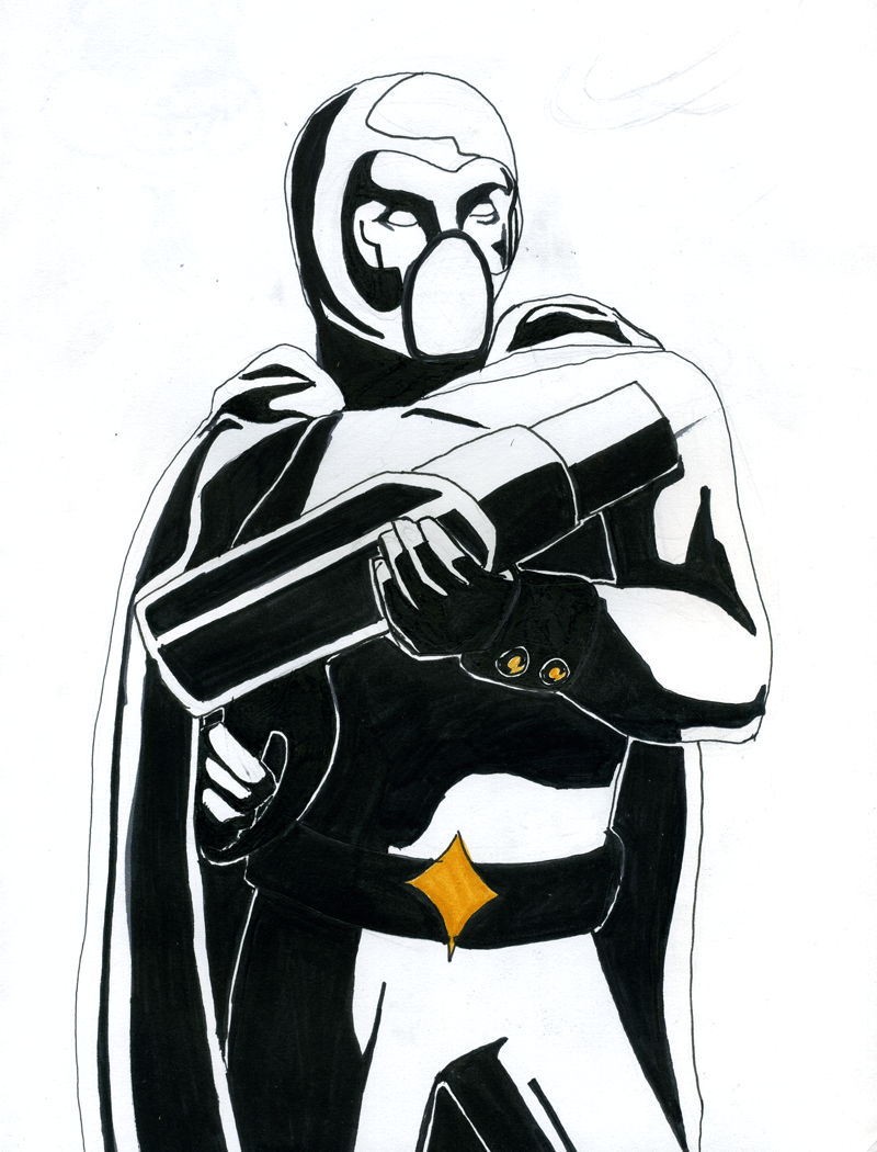
New image for project


I did this one right before class - I'm really proud of it, and I think that it stands as an image by itself, even without all the stuff I'm going to have to fiddle with in Photoshop and Illustrator so that it works with the rest of the series. It has a definite military bend, and feels starker than the other images. I like that. Hopefully, when I add color around and to it, it'll keep that feel.