5.30.2009

Prospective magazine illustration


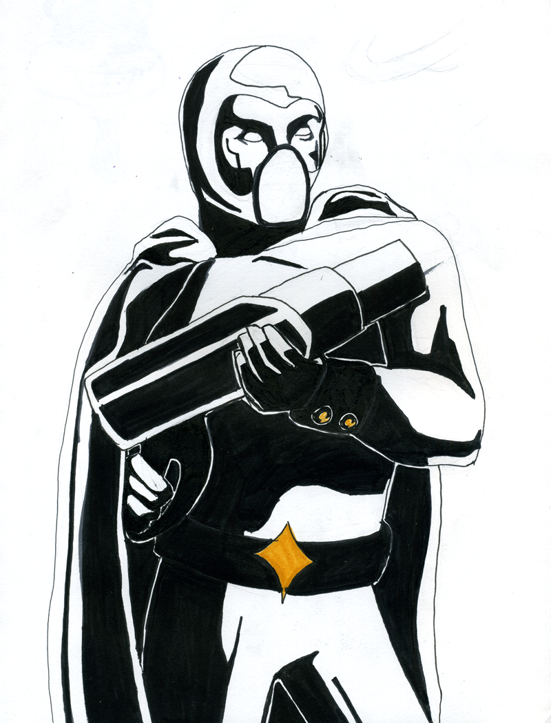
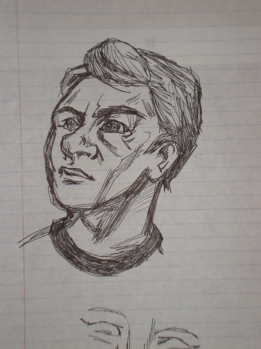
This is an illustration I've submitted to my college magazine. I think it will get into the magazine if only because it might be the only one that was submitted. I take what I can get.

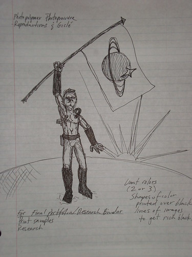
The article this was done for is apparently about Proposition 8. I haven't actually read it, which made me slightly uncomfortable, but hey, you do what you can.

5.28.2009

New image for project


I did this one right before class - I'm really proud of it, and I think that it stands as an image by itself, even without all the stuff I'm going to have to fiddle with in Photoshop and Illustrator so that it works with the rest of the series. It has a definite military bend, and feels starker than the other images. I like that. Hopefully, when I add color around and to it, it'll keep that feel.

5.27.2009

Typography: CD Cover


And this is my third project for my typography class. It's just making a CD cover for a band, for their "new" album, using only typography. The typeface is from the free font site I listed in an early post, and is called "28 Days Later," and yes it's based off the movie. The band, as you can see, is Arcade Fire. I haven't decided which I like better, so I've posted all of them I'm deciding on. I know there are very few differences between them, but really, that just means I'm almost done.

Soviet and Sci-Fi Poster


My final project for my digital printmaking class, as I've mentioned, is a mash-up of Soviet propaganda posters and extraterrestrial colonization. I've done some initial work on the posters today and cranked out three. It only took 8 hours or so. I think part of that was working on a project for another class, though. More than makes up for being laid up in bed for 24+ hours - all because of tasty raspberries.

The figures are grayed out is because I'll be drawing on them after I print them - just to see how it'll turn out. And I want to print those images first, then draw them out, probably in Sharpie. Good ol' Sharpie.

5.24.2009

Penguin + Sandwich (Board)


Just a quick snapshot of a sandwich board I decorated for work. It was fun.


A close-up of the penguin I added for proper mood.

Gadzooks


I have some sketches, but mostly ideas. My final project for my digital printmaking class is going to be to create a series of posters in the style of Soviet propaganda posters with the theme of colonization of other worlds. I'm pretty excited about it, actually. I've done a few preliminary sketches, and I'm collecting the necessary visual resources (thank you very much A Soviet Poster a Day for existing and providing so many awesome posters).


If any one runs across a propaganda poster they think would make good resource material, don't hesitate to throw me a link.


5.20.2009

Typography


Well, it's been a while, but here are a couple of recent exercises that I completed for my typography class. The first is a poster that is based on a font by a designer of my choice (I chose Kris Holmes of Holmes & Bigelow). The font, if I remember correctly, is Lucida Grande.


The second is a pattern based on a single letter from a font, rotated and copy in Illustrator. The font I used is called Red Right Hand is a font based on the Hellboy comic.

Oh, and if you want some awesome free fonts, I'd go here.

5.04.2009

deviantArt: now with more me.

Just a quick notice to all of you that may want to support me eventually in the future - I'm now on deviatArt, where you can comment on my arts and perhaps even buy a nice print of some of my work. I don't have anything on there that's amazing yet, but I imagine in the next few weeks to have art for sale that is good enough to buy.

This is my page. It's a bit sad right now, but I'm still getting used to the interface and all that.